Concept, art direction and
graphic design: Anna Bárdy, Ádám Katyi
Year: 2016
MOME REBRANDING
Concept
In late 2016, we were invited to take part in our former university's rebranding tender, which was a great honour. We are friends and ex-classmates from MOME who live and work in two different countries. We needed to combine our forces and spend some days together working out something smart for this project, which was quite a delightful process and meant us a lot as alumni students.


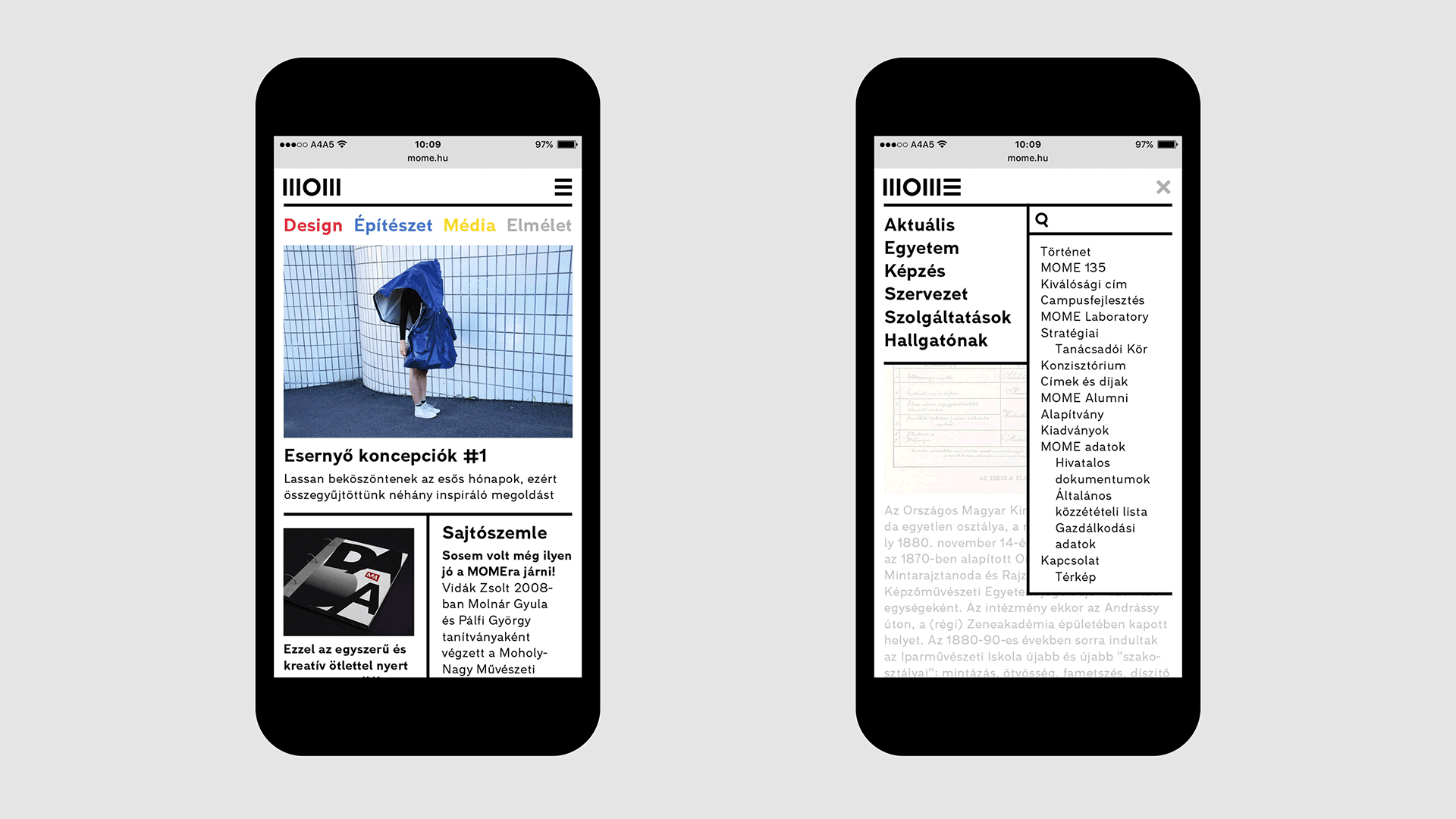
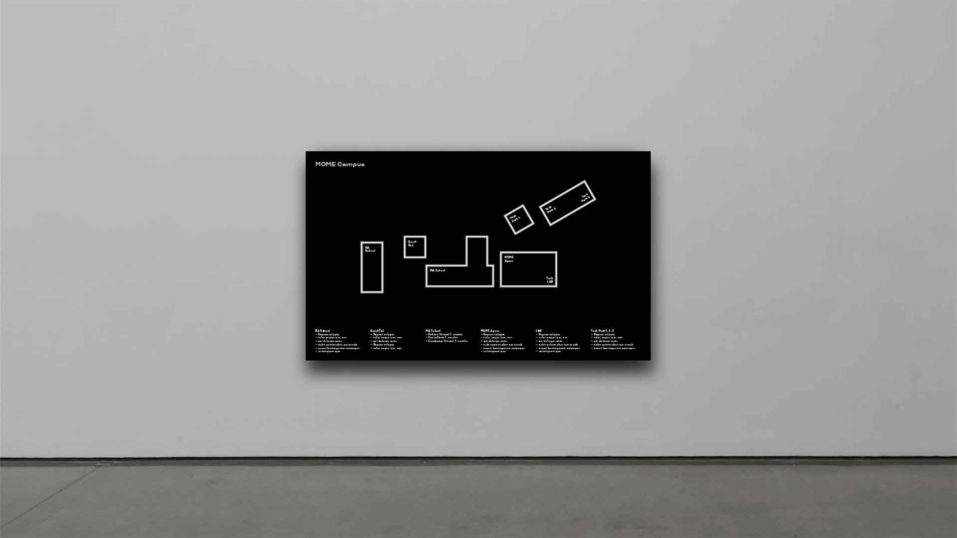
Our vision was to design an open-minded, steady and straightforward identity, which embodies the university’s main principles: the respect of conventions and progressive ambitions. The identity follows a specific proportional system and lacks any kind of redundant ornamentation. The goal was to design a very functional and rational system, which is easy to use. The graphic system was inspired by László Moholy-Nagy's layouts from the 1920s.

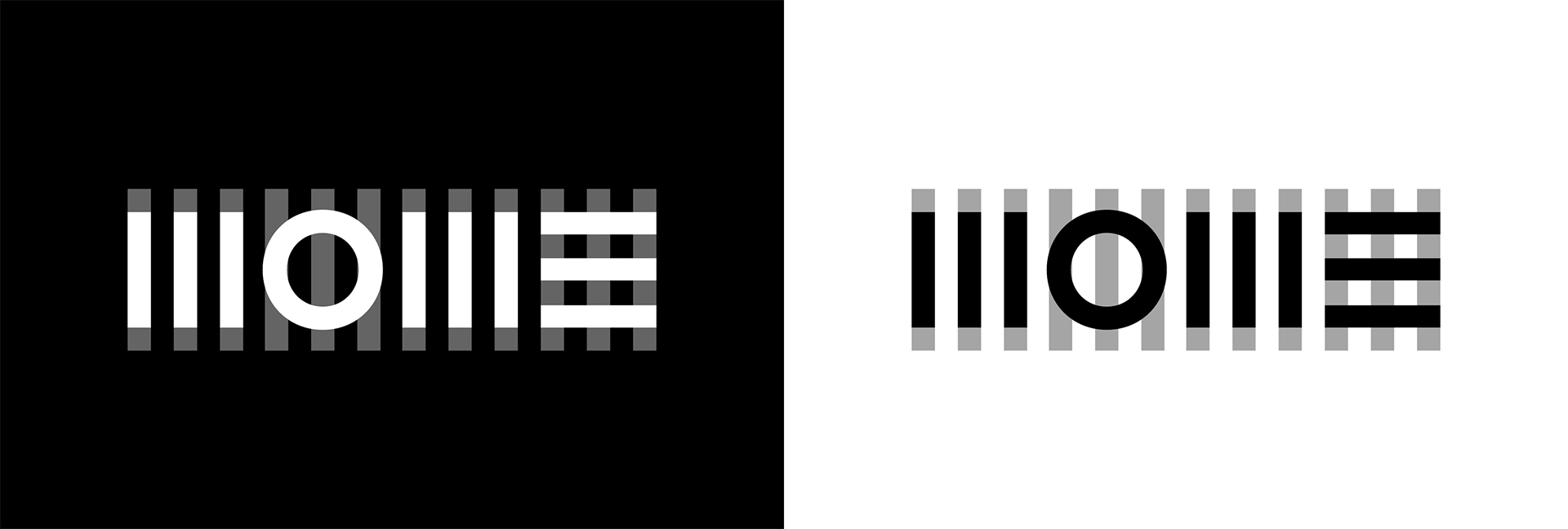

Both the original and the updated logo are composed of basic shapes and the graphic layouts adopt the same principle. The system - made up of vertical and horizontal lines - structures the written and the visual content and modulates them into balanced visual compositions. Consequently the content is either concentrated or structured into clear geometric systems. This construction is designed in terms of functionality.

The defined proportional system is also an important element of our concept, as it maintains the coherence in the visual identity: on the one hand 1:2:4 proportions are applied in the font sizes on different graphic surfaces. The weight of the line structure is adjusted to the stem weight of the logo, on the other hand.